ivorymilk
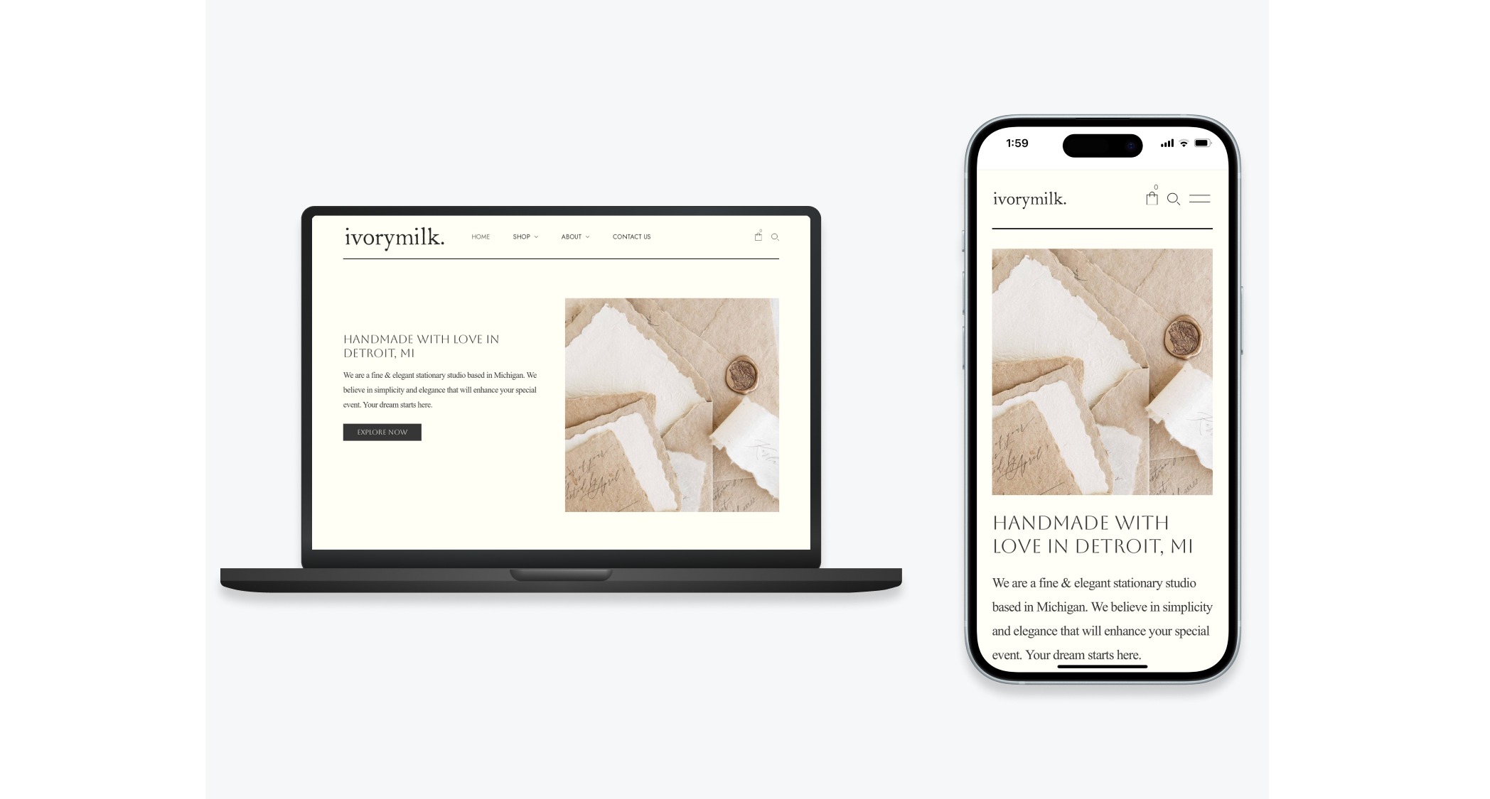
An elegant, responsive website that allows users to effortlessly navigate, view prices, and place orders. The result: a seamless and engaging experience that sets Ivorymilk apart in the market.
Overall Goal
The goal of this project was to create a user-friendly, responsive website for ivorymilk, an elegant studio, addressing the pain points identified through competitive analysis and user research. The objective was to enable customers to easily navigate, view transparent pricing, and place orders directly on the website.
Problem
The client approached me with a clear challenge: design a user-friendly, responsive website to address customer frustrations in the industry. The competitive analysis highlighted two major pain points:
Lack of price transparency: Customers often struggled with companies not displaying prices on their websites, leading to frustration and wasted time during the inquiry process.
Non-responsive design: Many competitors' websites were not optimized for mobile and tablet users, hindering their ability to make orders on these platforms.
Solution
User-Centric Information Architecture
To address the navigation issues, I implemented a user-centric information architecture. The main page prominently featured essential information, allowing users to easily find products and services.
Transparent Pricing
I integrated a transparent pricing model, ensuring customers have immediate access to product costs. This not only saves time but also builds trust with potential buyers.
Intuitive Product Selection
A user-friendly product selection process was designed to allow users to quickly locate and explore desired items, further enhancing the shopping experience.
Streamlined Ordering System
A robust ordering system was implemented, enabling users to place orders directly on the website. This functionality minimizes friction in the buying process.
Contact Option for Custom Orders or Inquiry
For users seeking custom orders or additional information, a clear and accessible contact option was provided, ensuring all customer needs are addressed.
Discover
I interviewed 85 users, gathering valuable insights into their preferences and pain points. The data revealed significant trends and concerns.
I don't have time to play email tag. If I can't see the price upfront, I move on to the next website. Time is money!
- CG
I'm always frustrated when I can't find prices on a website. It feels like they're hiding something. I'd love a platform that's upfront about costs.
- CC
I do a lot of my work on the go, so a website that doesn't work well on mobile is a deal-breaker for me. It's frustrating when I can't place orders from my tablet.
- FE
User Interviews:
• Out of 85 respondents, 82% said they were more likely to make a purchase if prices were clearly displayed.
• 72% of survey participants stated that they have abandoned a purchase due to lack of transparent pricing. This demonstrates a direct correlation between pricing transparency and conversion rates.
• 67% of respondents mentioned that they found the inquiry process time-consuming and inconvenient. They felt it was a waste of their time to contact companies only to discover that the product was out of their budget.
• 89% of respondents indicated that they shop online using their mobile devices at least once a week.
• Of those who shop on mobile, 75% stated that they prefer making purchases on websites that are mobile-friendly. This emphasizes the importance of responsive design.
Competetive Analysis Insights:
• Among the top 5 competitors, only 1 displayed prices directly on their website. This indicated a significant industry-wide gap in pricing transparency.
• Customer complaints related to pricing transparency constituted 30% of negative feedback in competitor reviews. This underscores the importance of addressing this issue.
• 3 out of 5 competitors had websites that were not optimized for mobile or tablet users. This represented a notable opportunity to gain a competitive edge.
• Google's Mobile-Friendly Test indicated an average mobile usability score of 45/100 for competitors' websites. This highlighted a widespread problem in the industry.
These insights provided the foundation for the design decisions made in the Ivorymilk website design, ensuring that user concerns were directly addressed, ultimately leading to a user-friendly and effective platform.
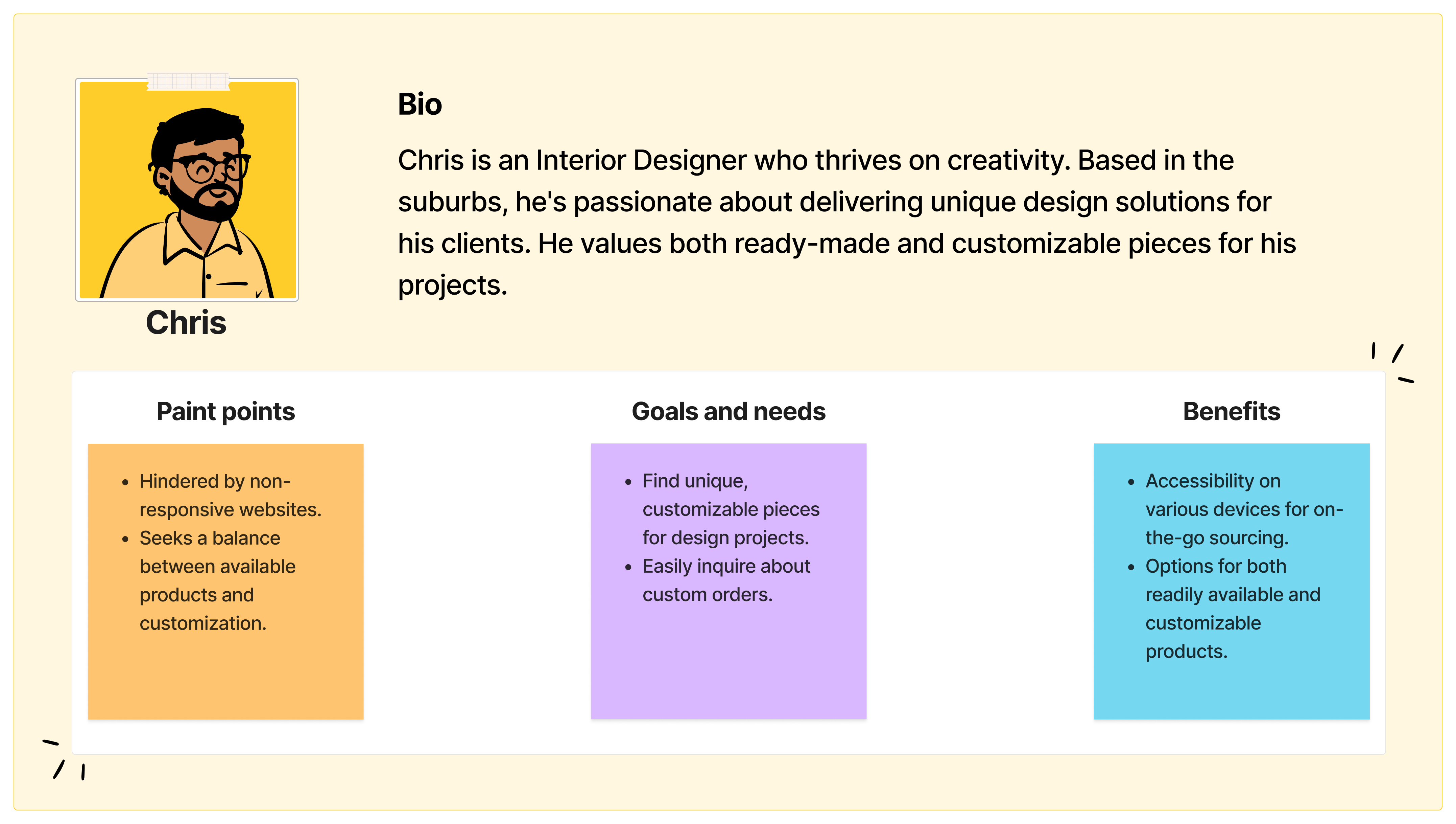
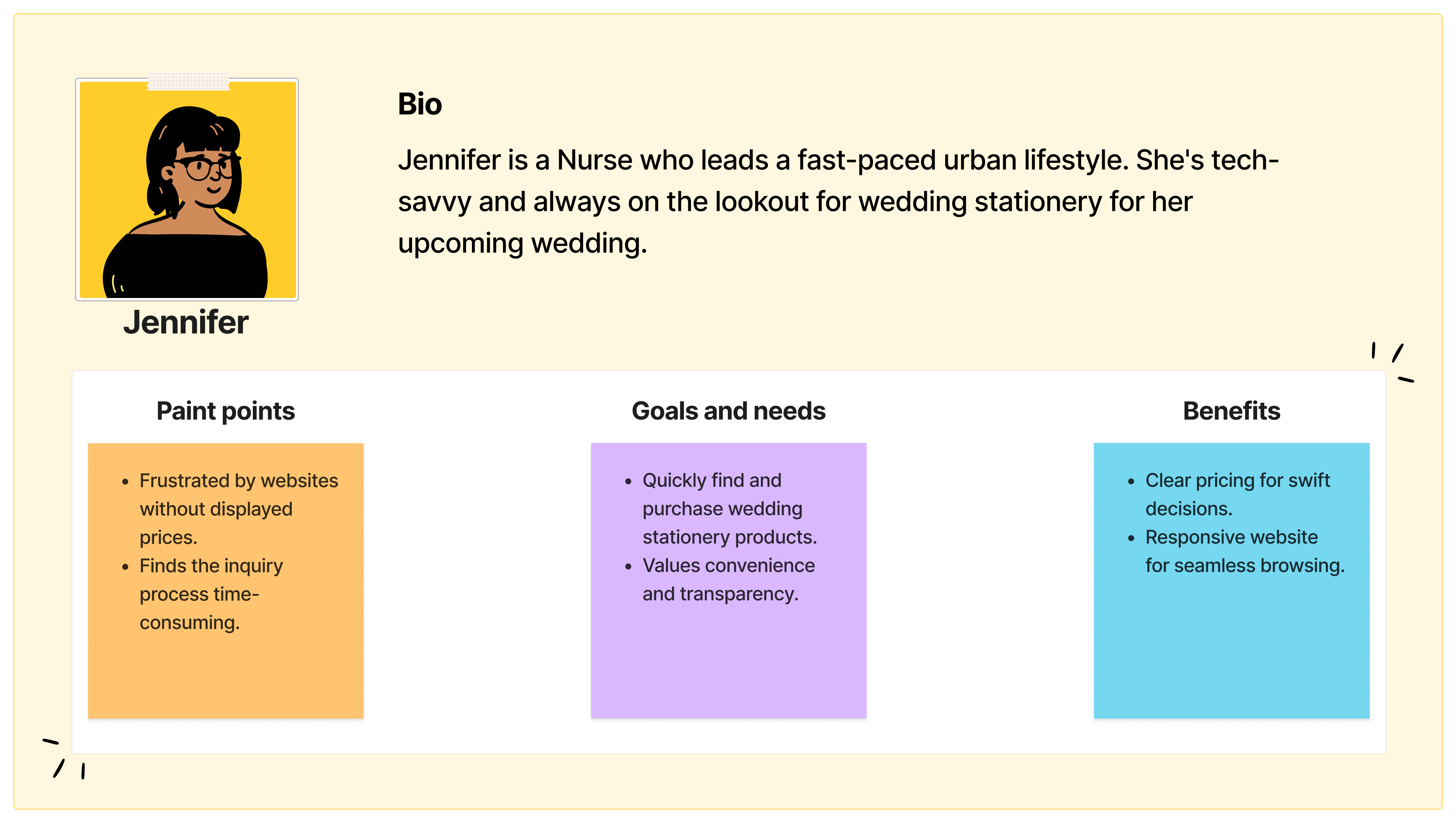
I created two different user personas that allowed me to empathize with the end-users and better follow a human-centered process.
Define & Ideate
Our research revealed that the most effective way to address the pain points we discovered was to create an e-commerce website with a user-friendly design. The key insights from our research pinpointed the need for:
Pricing transparency: Users were frustrated by the lack of upfront pricing information. By developing an e-commerce platform, we could offer clear pricing, building credibility and trust with consumers.
Mobile responsiveness: In today's mobile-centric world, a responsive e-commerce platform ensures users can shop conveniently and swiftly, especially when on the move.
Mid-Fidelity Wireframe
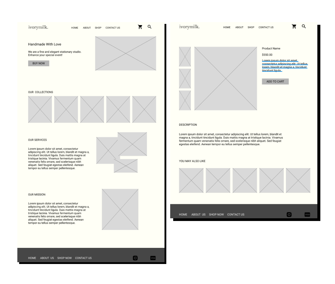
To bring our vision to life, I embarked on the design phase. Leveraging the insights gathered, I began by crafting an interactive low-fidelity wireframe. This initial design served as the foundation for the website, allowing for a structured representation of the user interface.
The mid-fidelity wireframe was intentionally kept simple to focus on core functionalities. It provided a visual framework for the layout, navigation, and key elements of the website.
With the wireframe in hand, I sought input from both users and the client. This iterative feedback process was invaluable in refining the design, ensuring it aligned seamlessly with their expectations and preferences.
Users appreciated the clear layout and straightforward navigation. Their input guided adjustments to further enhance usability and address any remaining pain points.
Engaging the client in the wireframing process allowed for a collaborative approach. Their insights and feedback were seamlessly integrated into the evolving design, ensuring that the final product would fully meet their vision and business objectives.
Here's a screenshot of the low-fidelity wireframe:
High-Fidelity Prototype
With valuable feedback from users and the client, it was time to transition to the high-fidelity prototype. This stage involved refining the wireframe to incorporate specific design enhancements and client-requested tweaks.
Client-Requested Improvements
• Font styles and icon outlines: the client emphasized the importance of font styles for brand identity. Additionally, they preferred outlined icons over filled ones for a cleaner aesthetic.
• Increased call-to-action Buttons: to optimize user interaction and accessibility, more prominent call-to-action buttons were integrated. This ensured users could swiftly access essential information and streamline the ordering process.
• Instagram feed integration: an Instagram feed was strategically placed at the bottom of the main page, adding a dynamic element that showcases ivorymilk's latest offerings and builds a stronger brand connection with users.
• Footer section enhancements: the footer was expanded to include additional links, providing easy access to policies and further enriching the user experience.
Generic Improvements
• Optimized visual elements: images and graphics were carefully selected and optimized for faster loading times and an overall more visually appealing experience.
• Consistent branding elements: colors, typography, and design elements were meticulously curated to maintain a cohesive brand image throughout the website.
• Seamless navigation: intuitive navigation was a key focus, ensuring users could effortlessly explore products and services.
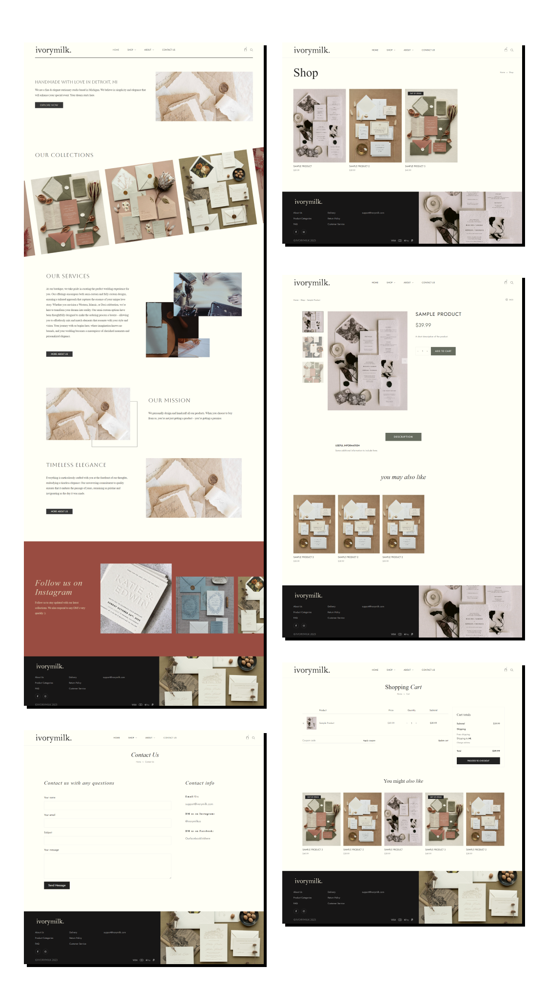
After incorporating these improvements, the high-fidelity prototype emerged as a refined representation of Ivorymilk's elegant studio. The design enhancements not only elevated the aesthetic appeal but also improved user accessibility and engagement.
Screenshots of the final high-fidelity prototype:
Outcomes & Lessons
Navigating the ivorymilk project presented a series of challenges that ultimately led to valuable insights and growth. One notable limitation was the tight timeline, requiring efficient time management and prioritization. To mitigate this, I established clear project milestones and maintained open communication with the client to ensure progress aligned with expectations.
Looking back, I would allocate more time for in-depth user testing to further refine the user experience. This would have allowed for even more nuanced optimizations and potentially uncovered additional pain points.
Through this project, I learned the critical balance between adhering to client preferences and advocating for user-centric design. It reinforced the significance of iterative feedback loops, ensuring the final product resonates both visually and functionally.
As the project concludes, my next steps involve continued collaboration with the client for any post-launch refinements and monitoring user feedback for potential future enhancements. This experience has equipped me with a deeper understanding of creating user-friendly, responsive designs within defined constraints, enriching my skill set for future endeavors.

