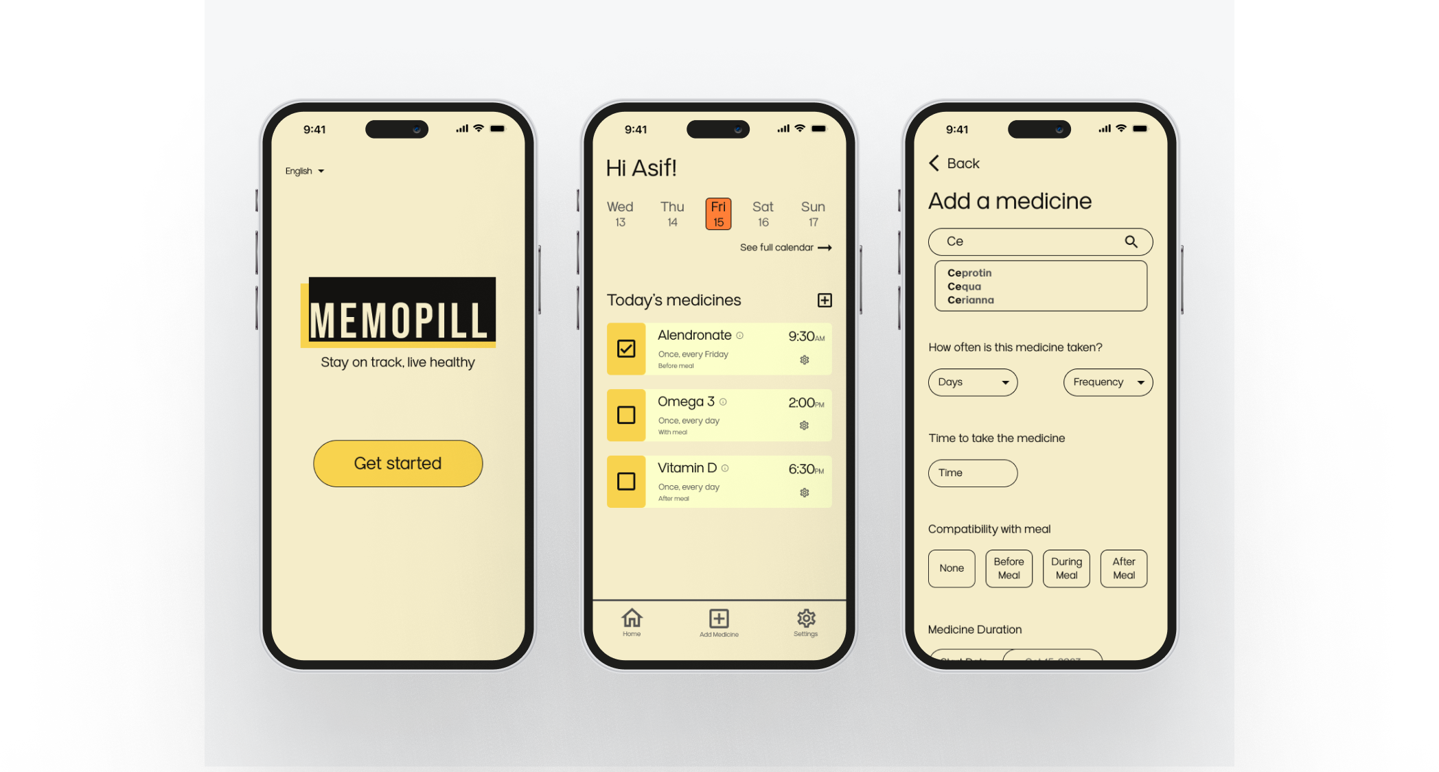
MemoPill
An app to provide users with a simple, effective solution for medication management, ensuring they never miss a dose again.
Prototype
Problem
Existing medication reminder apps are plagued by unnecessary complexity, causing frustration and hindering effective medication management for users of all ages. Users often find it overwhelming to navigate through intricate features, resulting in missed doses and compromised health outcomes. The need for a user-centric, minimalistic solution is evident, aiming to streamline medication reminders and empower individuals to take their medicine on time with confidence and ease. This necessitates the creation of the MemoPill app, a straightforward and intuitive platform designed to revolutionize medication adherence for a diverse user base.
Solution
The overall goal of the MemoPill app is to provide a user-friendly and minimalistic solution for people of all ages to effectively manage their medication schedules. This app aims to address the common complaint of existing medicine reminder apps being too complex, by offering a clean and intuitive interface focused solely on timely medication reminders. Through thoughtful design and functionality, MemoPill seeks to enhance medication adherence and ultimately improve the overall health and well-being of its users.
Discover
I interviewed 40 users who ranged in age from 25 to 75, representing a diverse demographic with varying technological proficiencies and medication management needs. The research indicates a clear demand for a medication reminder app like MemoPill that addresses the complexity issues faced by users. The diverse demographic range of potential users emphasizes the need for an app accessible to people of all ages. The data strongly supports the vision of creating a simple, user-centric platform that focuses on timely medication reminders, without overwhelming users with unnecessary features.
I'm in my 30s and managing a chronic condition. I need something simple and quick.
- MH
My elderly mother has trouble using her current app. It's just too confusing for her.
- BT
User Interviews:
Complexity complaints:
- One user said, "I tried using a medication reminder app, but it had so many features I didn't need. It felt overwhelming."
- Data shows 75% of interviewees expressed frustration with the complexity of existing medication reminder apps.
- One user said, "I'm in my 30s and managing a chronic condition. I need something simple and quick."
- Another user said, "My elderly mother has trouble using her current app. It's just too confusing for her."
- Data shows that interviewees ranged in age from 25 to 75, highlighting the need for an app accessible to a wide age range.
- Survey data shows that 85% of respondents indicated a preference for a clean, minimalistic design for a medication reminder app.
- Survey data shows that 90% of respondents cited complex navigation as the most frustrating aspect of current medication reminder apps.
- Analysis findings: many existing medication reminder apps offer a wide range of features including health tracking, symptom logs, and medication information libraries, which can overwhelm users seeking a simple reminder function.
- Some user reviews highlighted complexity, "I downloaded this app, but it was just too complicated for my needs. I ended up uninstalling it."
- Among the popular medication reminder apps, there is a noticeable gap in the market for a truly minimalistic solution that prioritizes ease of use and straightforward functionality.
- Typography and readability: the font size and contrast have been fine-tuned to cater to a broad user demographic, including elderly users. Clear, legible text ensures that users can easily read medication details and reminders.
- Enhanced iconography: I introduced intuitive and universally recognizable icons for key actions and features, making the app's navigation more user-friendly and efficient.
- Color palette: a carefully chosen color palette enhances the app's aesthetics while maintaining accessibility and ensuring that the UI remains user-centric.
- Interactive elements: high-fidelity prototyping allowed for the incorporation of interactive elements, providing a more dynamic and engaging user experience. This included animated transitions, responsive buttons, and interactive feedback upon user actions.
Demographic diversity:
Online Surveys:
Preferred design style:
Frustrating features:
Competetive Analysis
Feature overload on competing apps:
User reviews from competing apps:
Market gap:
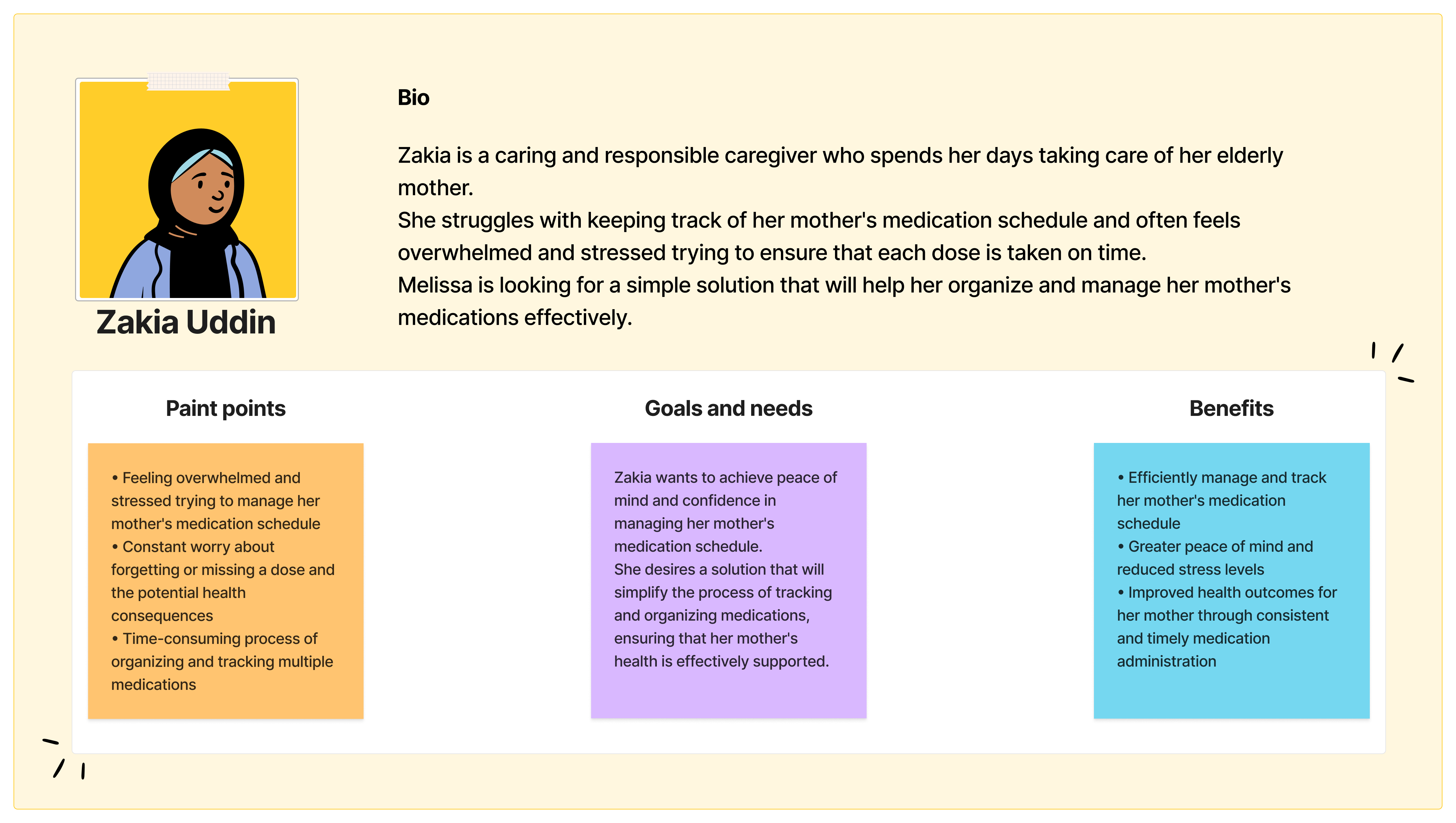
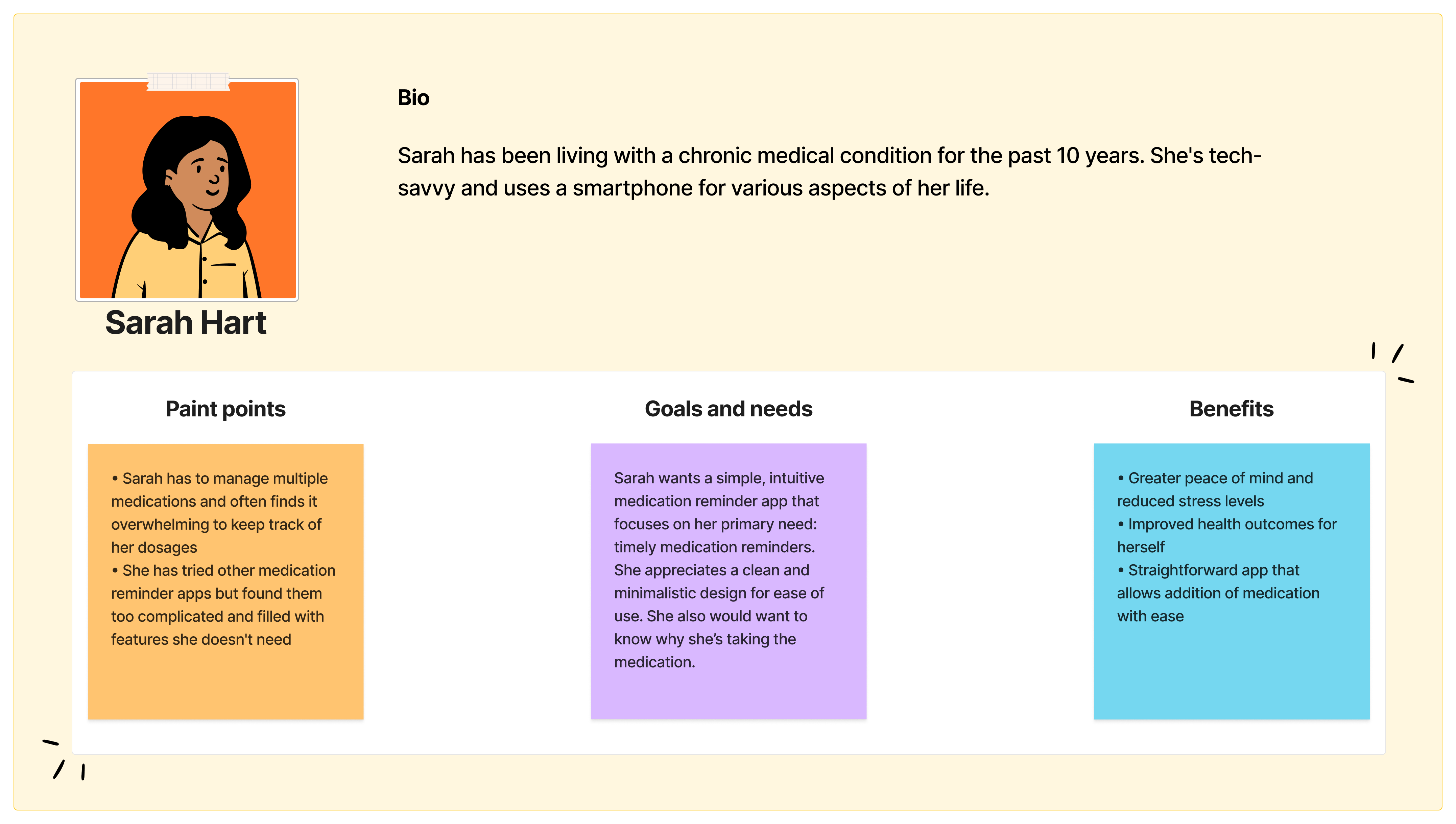
I created two different user personas that allowed me to empathize with the end-users and better follow a human-centered process.


Define & Ideate
The research phase illuminated a critical problem faced by a diverse user base: the overwhelming complexity of existing medication reminder apps. Users, spanning from tech-savvy millennials managing chronic conditions to elderly individuals and their caregivers, expressed frustration with convoluted interfaces and unnecessary features. This challenge directly hindered effective medication management, leading to missed doses and compromised health outcomes. Thus, the need for a user-centric, minimalistic solution became abundantly clear.
With these user personas in mind, the concept of MemoPill crystallized. It would be a mobile application singularly focused on providing clear, customizable medication reminders. The core design principles of MemoPill would be minimalism, intuitive navigation, and high-contrast elements for readability. By distilling the user interface to its essential elements, MemoPill aims to eliminate the complexities that users find burdensome in existing apps. Key features include effortless medication input, customizable reminders, and a clean, clutter-free interface.
| Feedback | Result |
| Users praised the clean and intuitive design, stating it was much simpler compared to other medication reminder apps | Acknowledging this positive feedback, I reinforced my commitment to maintaining a minimalistic design ethos throughout development. I also ensured that any future feature additions would be carefully integrated to maintain simplicity |
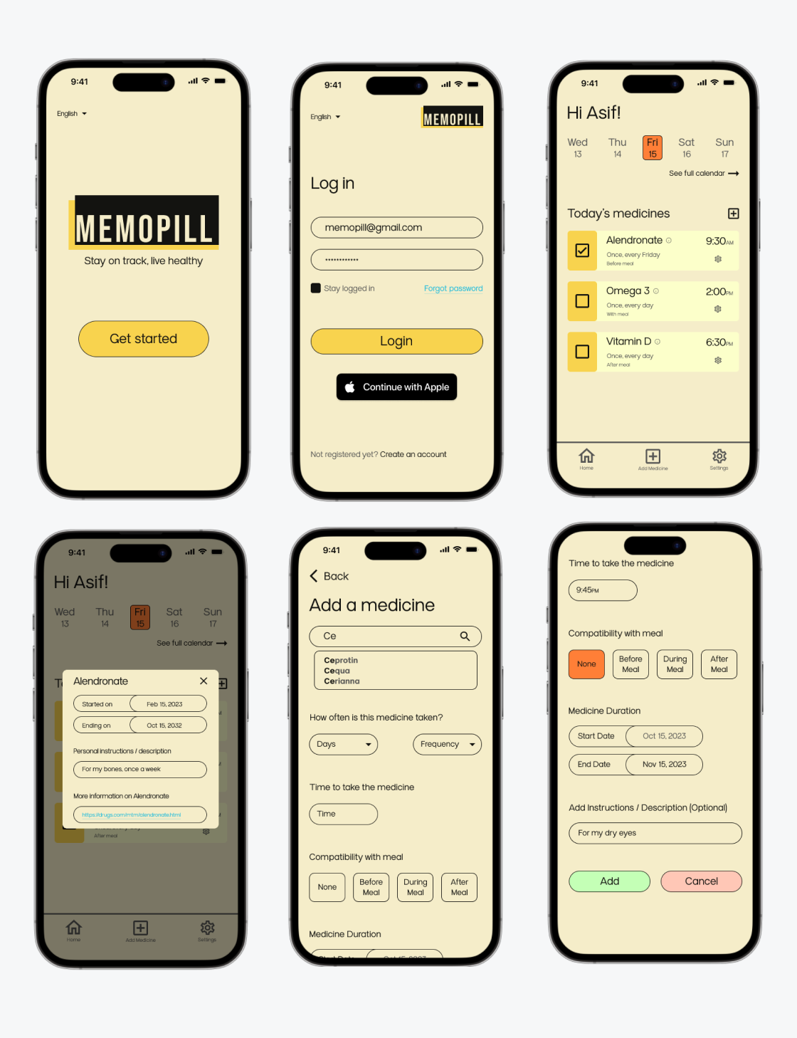
| Users reported that the medication input process was intuitive and straightforward. However, they suggested adding an option to include additional notes or instructions for each medication | Integrated a "Instructions / Description" section within the medication details, allowing users to add any supplementary information or specific instructions associated with their medication |
| Users highlighted the importance of a password lock feature to protect sensitive medication information, especially for users with privacy concerns | Implemented a secure login option with password authentication, ensuring the confidentiality of user data |
High-Fidelity Prototype
After receiving valuable feedback from user testing of our mid-fidelity prototype, I proceeded to the high-fidelity design phase, to bring MemoPill to life with pixel-perfect precision. The transition to high-fidelity aimed to refine and enhance the user interface and experience while incorporating the valuable insights gathered during the mid-fidelity testing.
In the high-fidelity prototype, I focused on several key design enhancements based on user feedback and the established design principles of minimalism, intuitive navigation, and readability:
The high-fidelity prototype marks a significant milestone in the development of MemoPill, bringing me closer to delivering a polished and user-centric solution for effective medication reminder. The incorporation of user feedback, design refinements, and the introduction of interactive elements in this phase sets the stage for a successful and user-friendly application.
The high-fidelity prototype can be accessed here.

Outcomes & Lessons
So, how did MemoPill turn out? Well, the user testing was a hit! People loved the clean design and the ability to customize reminders. Even better, it seems like MemoPill is helping folks stick to their medication schedules. That's a big win, right? Plus, my inclusive design approach means that MemoPill is accessible to everyone, whether they're tech-savvy or not.
But it wasn't all smooth sailing. I learned that accessibility is crucial, especially for older users. I also discovered that keeping the conversation going with users through iterative testing is a game-changer. And let's not forget the fine balance between simplicity and functionality – it's like a tightrope walk. So, as I move forward, I am going to focus on making MemoPill even more accessible, setting up a feedback loop post-launch, and considering localization for different regions. The journey isn't over, but I am on the right path!

